
Tutorial designs
Fictional brands and collateral
|
OPPORTUNITY
Tutorials about design techniques or tools are more helpful and inspiring when they show potential applications of the lesson in realistic contexts. However, one cannot create examples with the branding of actual companies. (At least not ethically!) SOLUTION I design fictional brands to help demonstrate the subject matter. Below are some fictional brands and products I’ve created for my published tutorials. |
|
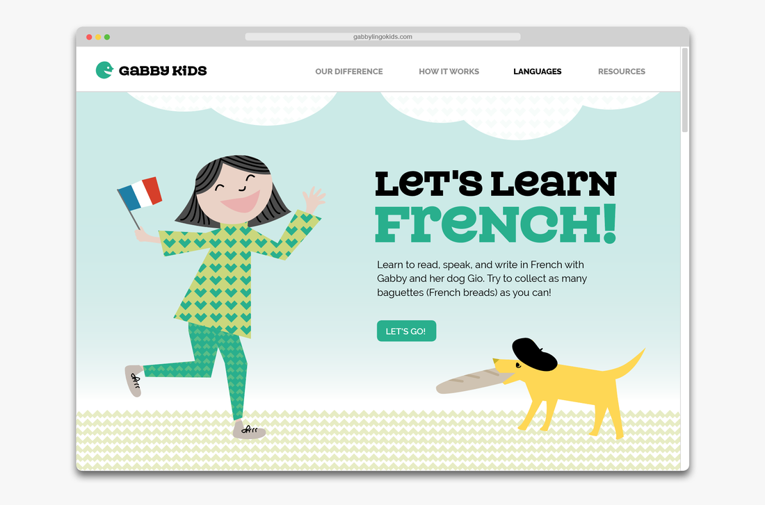
Gabby Kids | Children’s education company
A playful, chatty vibe for a foreign language learning product. Published on CreativePro. |
|
|
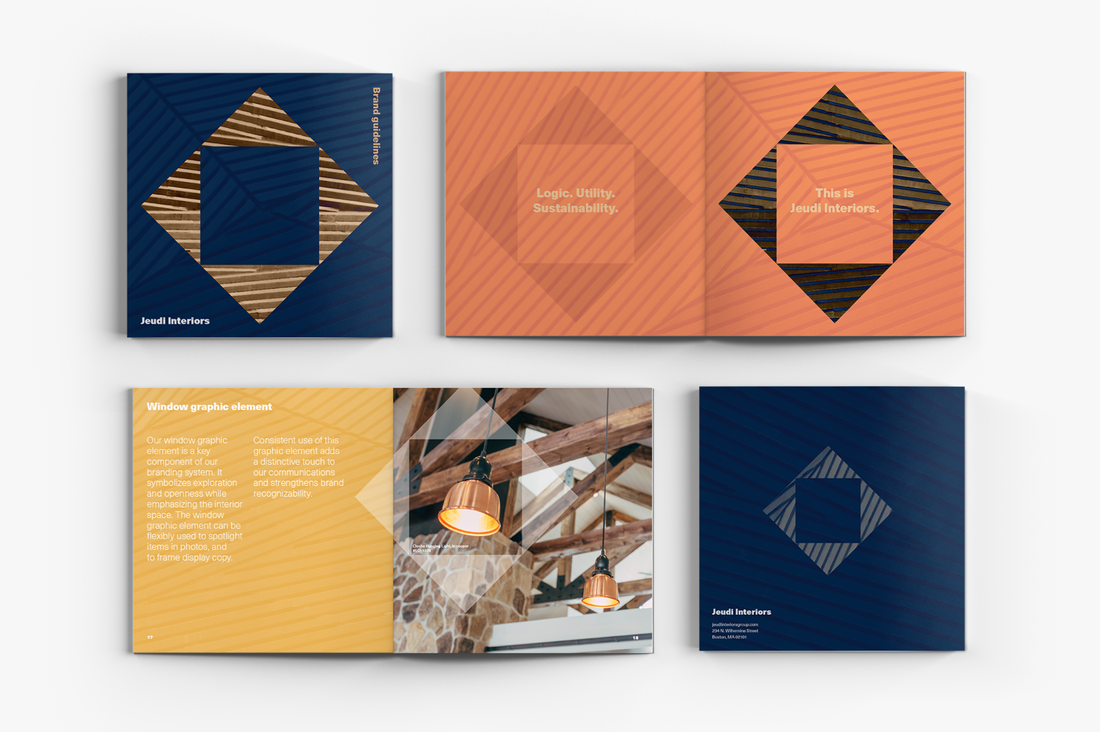
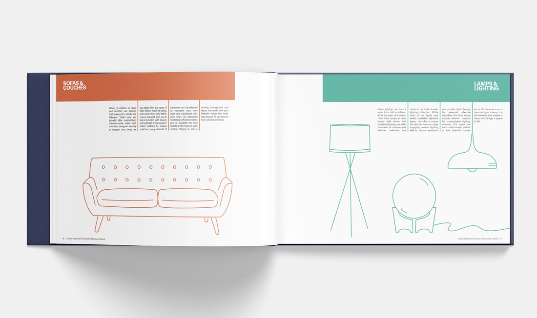
Jeudi Interiors | Interior design company
A window graphic symbolizes exploration and openness while emphasizing interior spaces. Published in InDesign Magazine. |
|
|
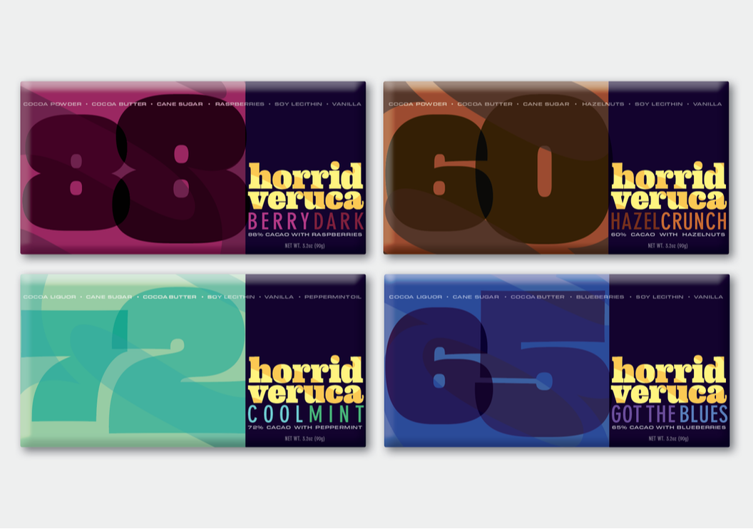
Horrid Veruca | Chocolate company
Bold, slightly psychedelic typography helps this brand stand apart. Underlying swirl fills suggest the blending of chocolate with other flavors. Published in InDesign Magazine. |
|
|
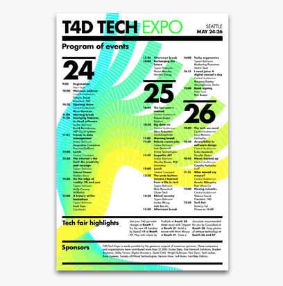
T4D Tech Expo | Conference branding
Fluid, neon lines mingle with firm, Swiss grid structures to create a fresh look for a tech conference. Published on CreativePro. |
|

|
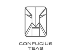
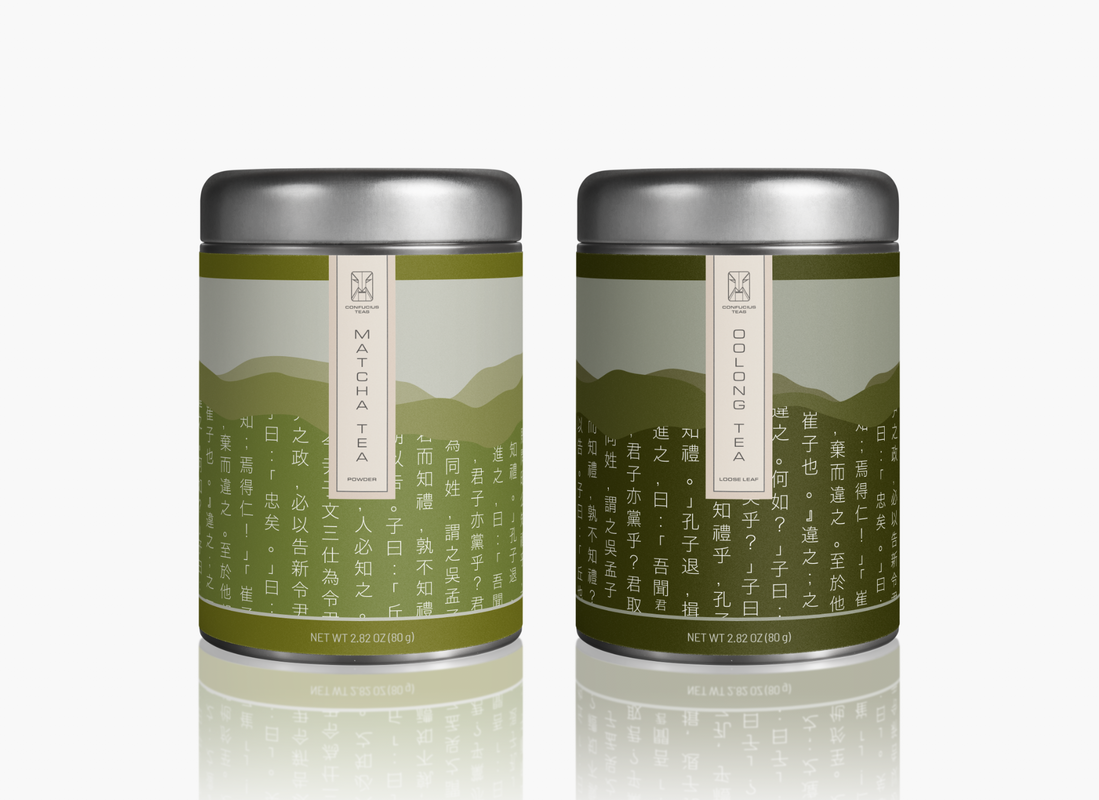
Confucius Teas | Tea company
A structured face suggests firm values, while the mountain range with a torn-paper look features Confucian sayings. Published in InDesign Magazine. |
|
|
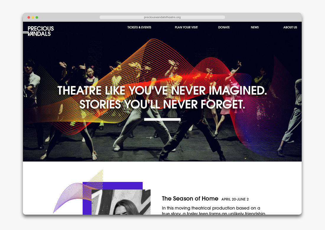
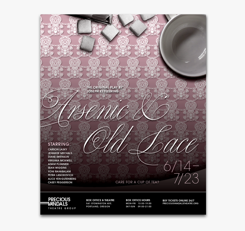
Precious Vandals | Theatre group
An edgy look for a theatre group reenvisioning drama. Published on CreativePro. |
|
|
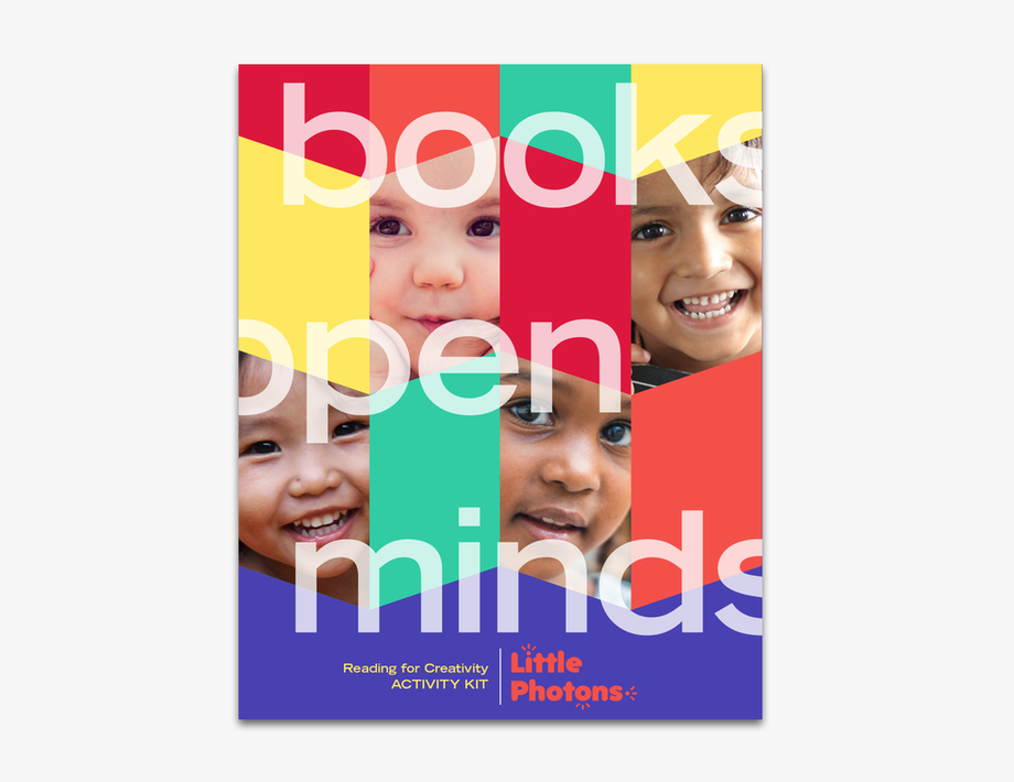
Little Photons | Children’s education company
Bright, bold colors and energetic angles convey fun and growth. Published in InDesign Magazine. |

|
|
Mure Store | Stone carving company
A gray oval portrays reliability and stability. The graphic system of table-like forms resembles a mountain (quarry). Published in InDesign Magazine. |

|

|
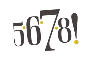
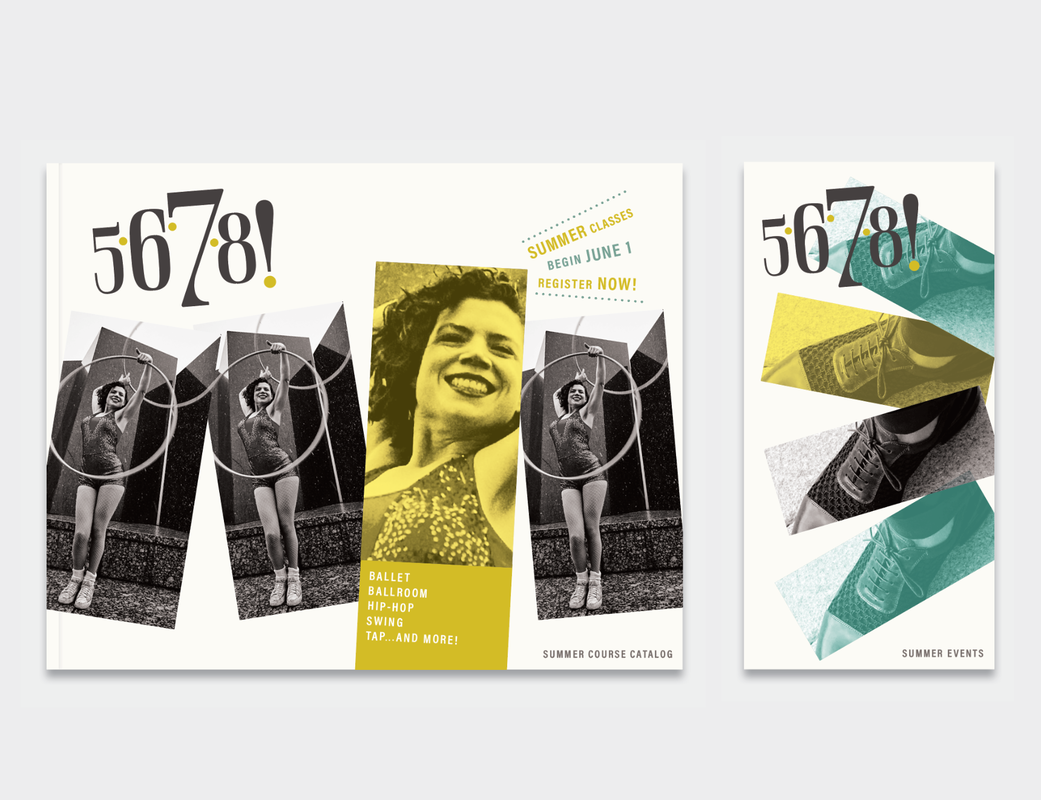
5-6-7-8! | Dance studio
Type and photo mirror the bouncy beat of a warm-up countdown. Dots hint at the classic diagrams used in teaching dance step sequences. Published in InDesign Magazine. |
|
|
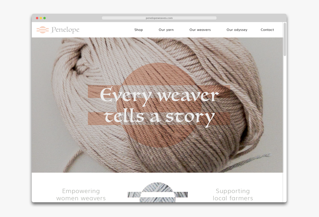
Penelope | Weaving cooperative
A shape reminiscent of a loom and sunsets (motifs in Homer’s The Odyssey), a yarn ball, knitting needles, the planet, and an equality sign (=) represents the story of this cooperative supporting women weavers. Published in InDesign Magazine. |

|
|
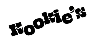
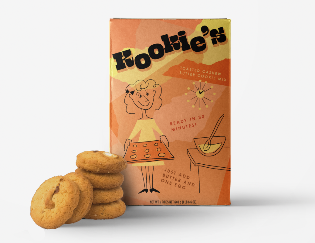
Kookie’s | Cookie mix company
A kooky, midcentury look for DIY baking. Published in InDesign Magazine. |
|
|
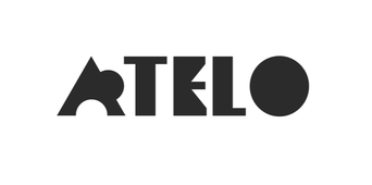
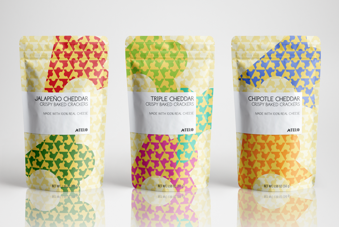
Atelo | Snack cracker company
The A is drawn to resemble a cracker with a bite taken out of it, which can be used to create tessellated patterns for packaging. Published on CreativePro. |
|
|
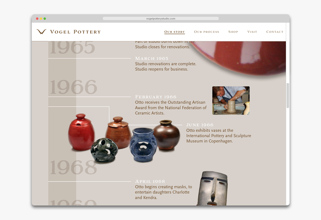
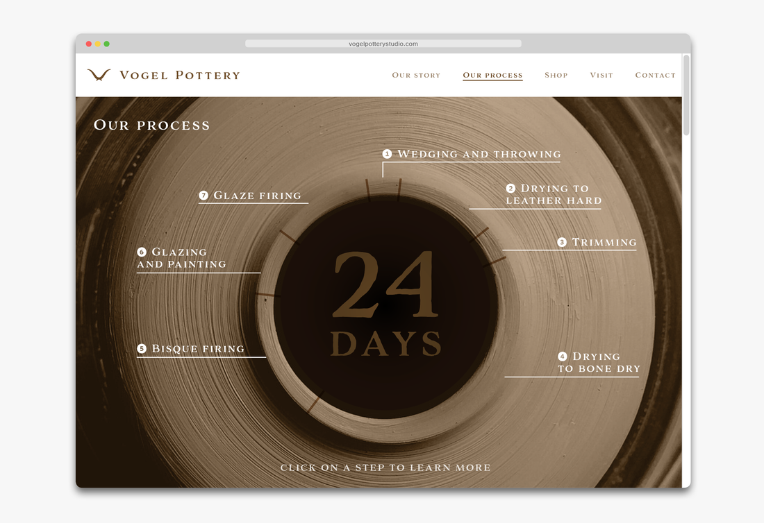
Vogel Pottery | Ceramics studio
The cross-section of a bowl suggests a bird (in German, Vogel). Published on CreativePro. |

|
|
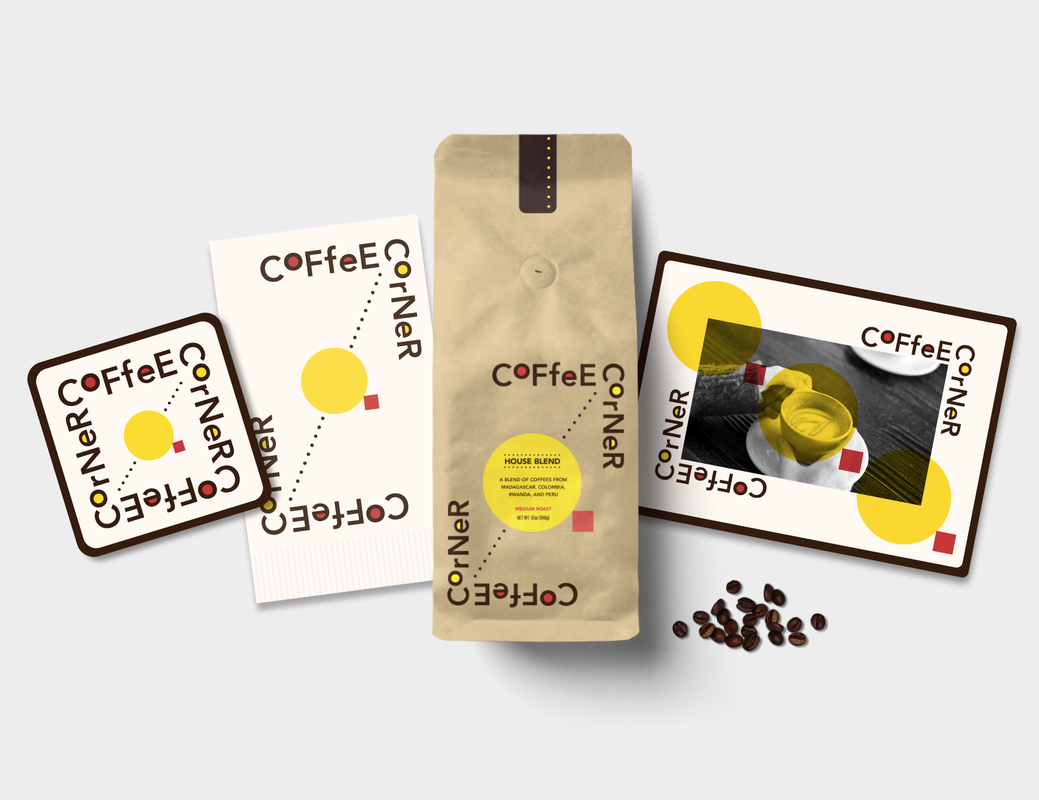
Coffee Corner | Coffeehouse
Pops of color and funky type lend a jittery look to this brand. A circle and a square combine in an icon to represent a coffee cup or table and chair. Published in InDesign Magazine. |

|
|
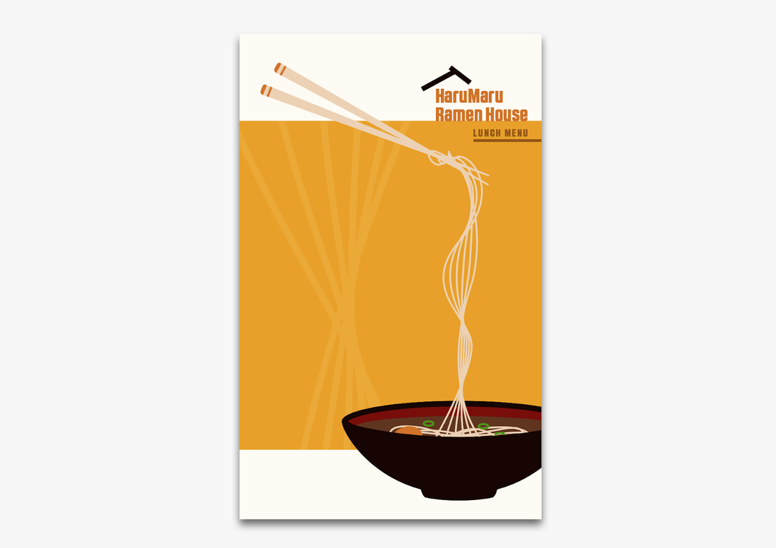
HaruMaru Ramen House | Restaurant
A chunky, modern look creates a hip, clean look. Published on CreativePro. |
|
|
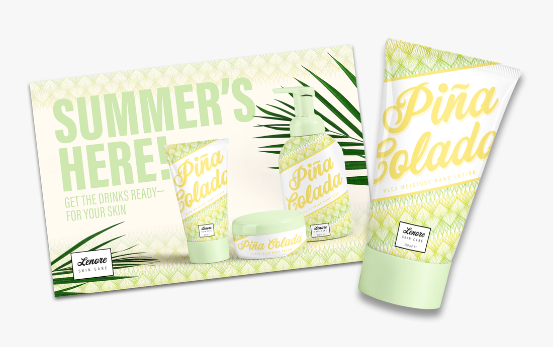
Lenore Skin Care | Skin care products
A simple and elegant logo easily matches seasonal themes. Published on CreativePro. |

|

|
|

Templates for "branding toolkit" app
|
OPPORTUNITY
Adobe Spark Post is an app that enables users to design branded graphics in seconds. For the launch of a grid-based design feature, we wanted to offer templates for users to remix. SOLUTION Since the target user was small business owners needing marketing design solutions, I felt that each template needed to appear branded and should reflect typical marketing needs for that user group. I produced a set of 20+ templates that were diverse in branding styles and could be easily customized, working within the constraints of the app's design and typographic tools. |

Click to visit the Adobe Spark Post website

|