Steinhart Aquarium
Centennial branding
|
OPPORTUNITY
The Steinhart Aquarium in San Francisco is home to nearly 40,000 live animals. To celebrate its 100-year anniversary, the aquarium team wanted a logo reflective of this long history while also suggesting forward momentum. Although the aquarium was established in 1923, the director desired a midcentury style because the aquarium grew most rapidly during those decades. The logo also needed to celebrate the centennial but also have the flexibility to separate it from its establishment date. SOLUTION I designed several logo options related to the aquarium’s history and the organisms it housed, narrowing down to three that could each lead to different graphic application styles. |
|
The selected logo design features the moorish idol (Zanclus cornutus), an iconic organism for the aquarium, swimming forward. I custom-drew the 1 in the 100 for a streamlined look suggesting both waves and fins.
|
|
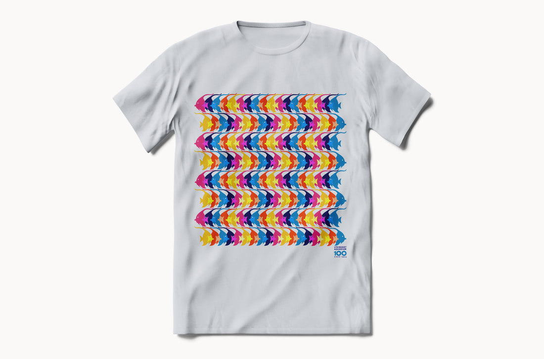
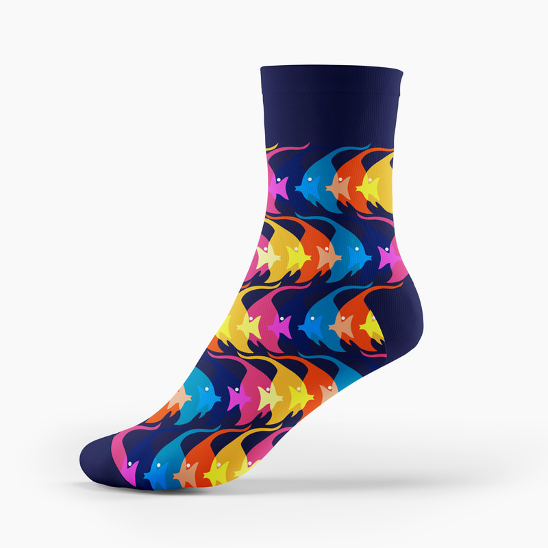
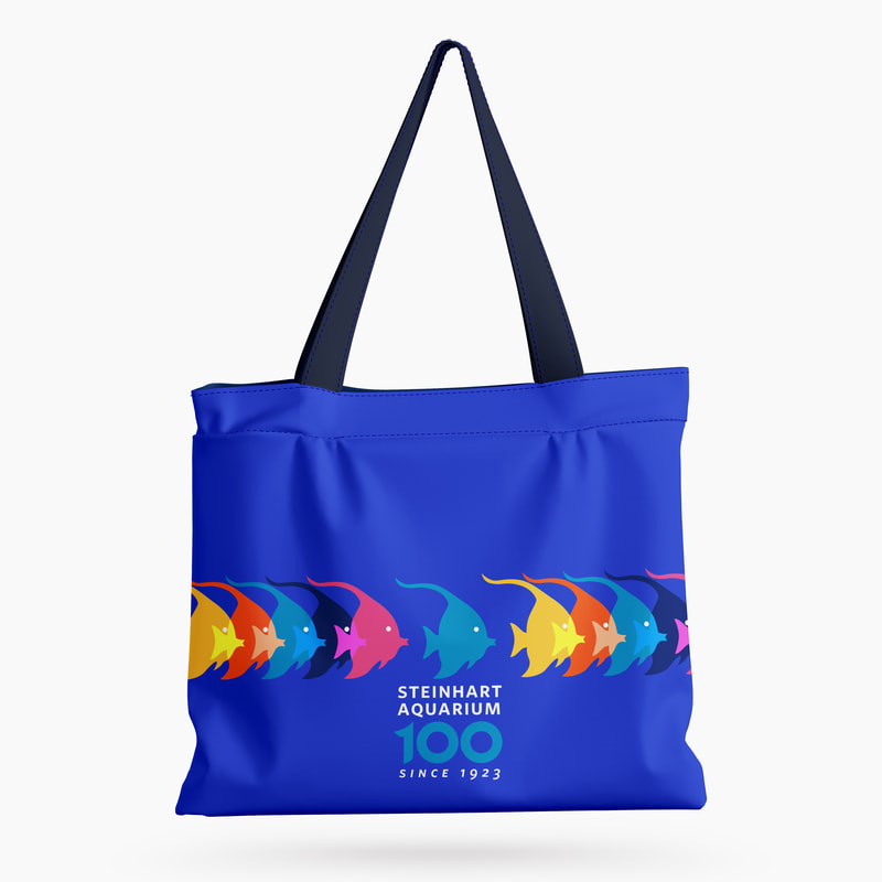
I also designed potential applications of the fish motif, modeling its ability to suggest movement and diversity across a range of formats:
|
|
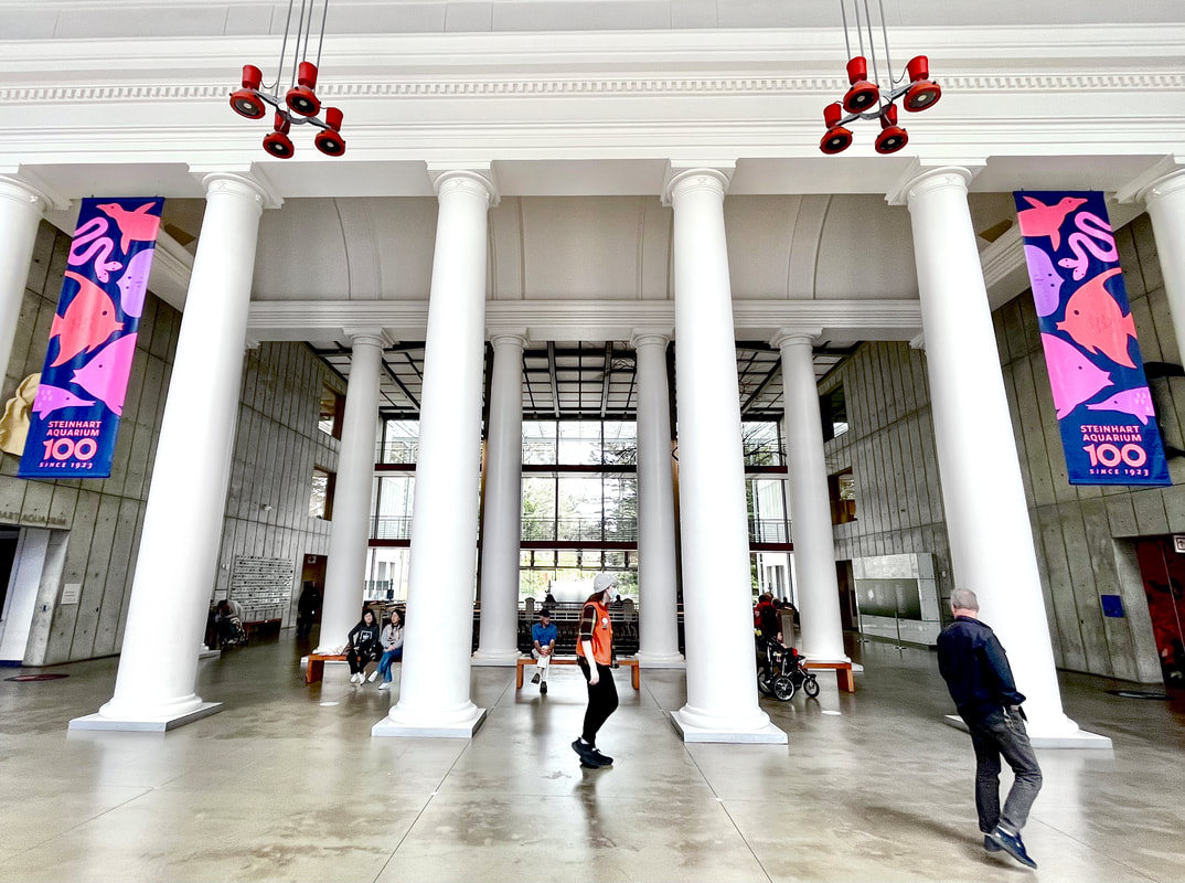
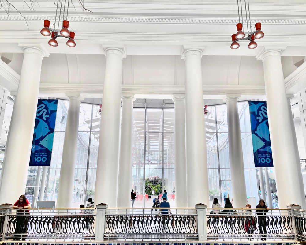
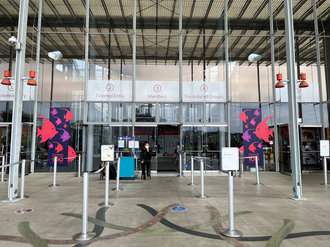
For signage and banners, I illustrated other iconic aquarium organisms, including a two-headed snake (yes, it existed!), a butterfly fish, an African penguin, and a honeycomb ray. Later I also illustrated an alligator gar, an albino alligator, manatee, Chinook salmon, an electric ray, yellowtail fish, and an Australian lungfish for additional placements.
Printed double-sided, these banners showed warm colors on one side and cool colors on the other. I selected colorways that work well both as separate groups and paired together. The “stacked animal” layout was inspired by a midcentury pamphlet that resurfaced in the Academy’s archives as we researched the aquarium’s history. |
|
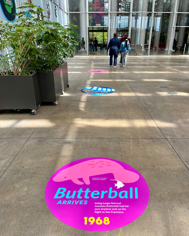
I also collaborated with Sterling Larrimore to create additional large banners, panels, and floor graphics. I illustrated all of the animals (minus the coral) and developed patterns. Sterling arranged them into dynamic layouts.
|
© 2024 Maya P. Lim


