Refreshed brand for online program
|
OPPORTUNITY
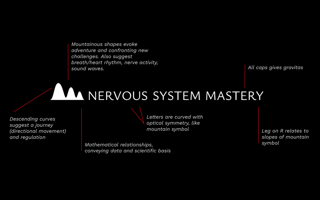
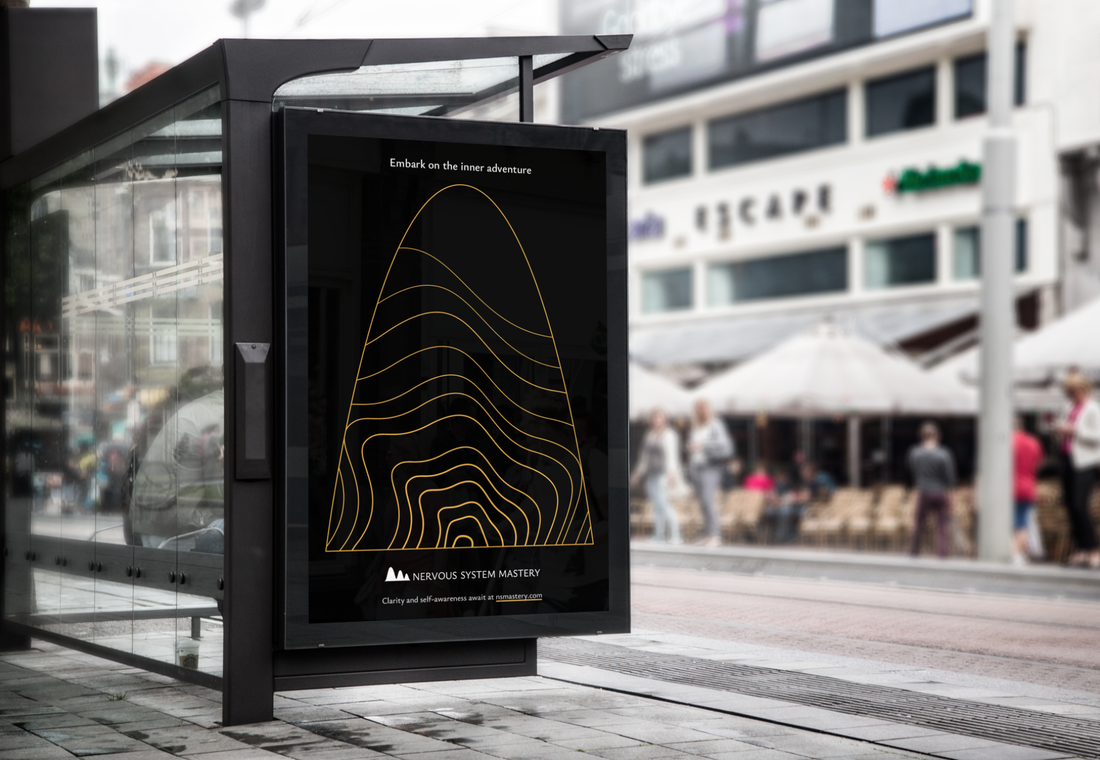
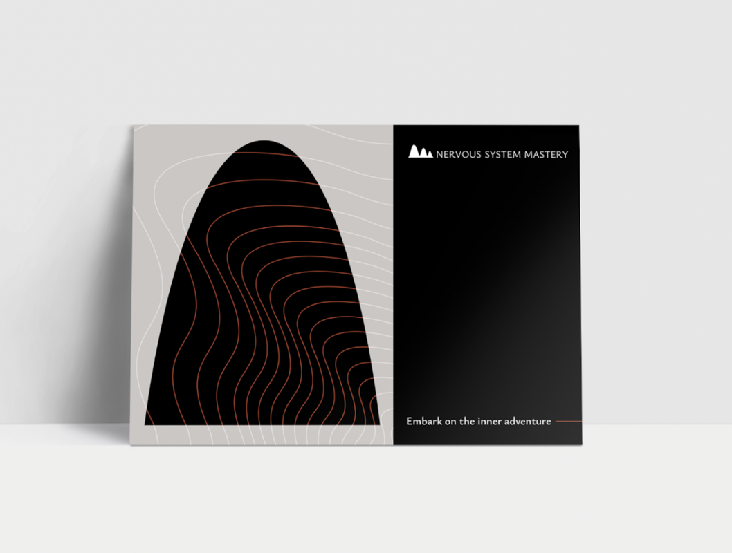
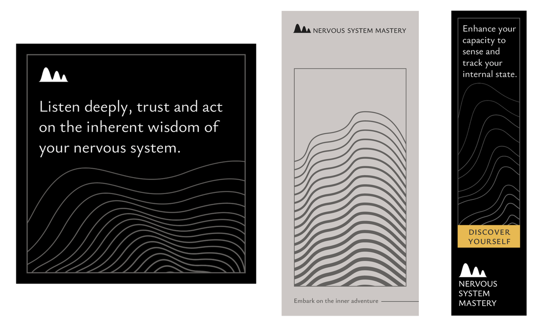
Nervous System Mastery is an online program helping people learn how to regulate their nervous system and gain clarity into their emotional landscape for better personal effectiveness. As the company grew, the founder realized that a brand strategy and distinctive visual identity was critical for its future success. The branding needed to evoke an inner journey, a scientific basis, and a serious yet adventurous tone. The previous logo was a set of lungs to represent breathwork, but the founder now wanted to portray a more holistic body–mind connection. SOLUTION As I conducted market research and sampled the program, it became clear that the auditory experience of the program was one of its special strengths. Every lesson was a sumptuously rich audio clip that felt like an intimate, meditative coaching session. I solo-designed a visual identity system based on waves—merging the idea of sound waves with brainwaves, breathwork, and neural activity. The result captured the founder’s hopes to suggest art meeting science, as well as adventure and seriousness. Topography maps were a graphic element used in the original branding. I evolved this idea to embody abstract waves and convey new landscapes as well as a continuous journey. Ysabeau, a typeface combining clean, strong lines with curved, organic features, imbues copy with a zen-like simplicity. A dark, grayscale color palette with limited pops of vibrant earthy colors sets a grounded but energizing atmosphere. |
Logo design notes
Applications
© 2024 Maya P. Lim

