Brand evolution and documentation
|
OPPORTUNITY
Located in San Francisco’s Golden Gate Park, the California Academy of Sciences is a natural history museum and research institution with a four-story rainforest, aquarium, and planetarium—all under one living roof. It receives more than one million visitors every year from around the world. While its audiences are diverse and constantly changing, its brand guidebook was roughly a decade old (that’s centuries in butterfly generations!). The Academy needed a refreshed set of visual branding principles and guidance in producing cohesively branded content. I also noticed a need for a technical specs document for design teams to reference in creating standard media. SOLUTION I designed and wrote all the copy for a new brand guidebook, thinking through brand strategy and implementation challenges. I worked with directors across multiple teams to develop new brand attributes and principles. I also identified a need for a design spec book, as uncertainty around technical specs frequently caused minor delays to workflows. I created a reference book of technical specs needed to produce our most common print and digital media. |
Tiered subbrands for museum donor groups
|
OPPORTUNITY
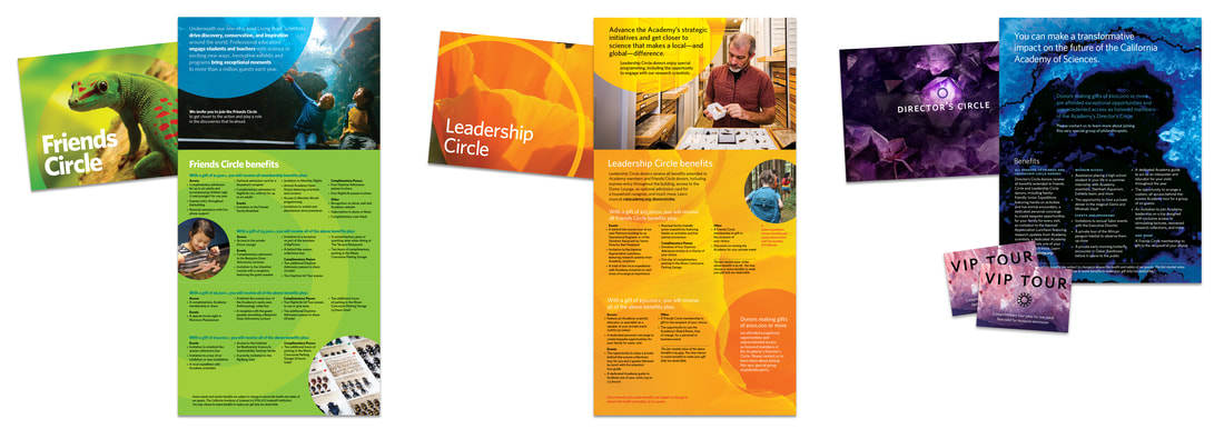
As a nonprofit, the California Academy of Sciences relies on donations to support many of its programs. When seeking to attract more donors and build loyalty, it decided on creating three tiers for donor support. SOLUTION Drawing upon audience insights, I created the visual system for the donor tiers, with wordmarks, graphic motifs, colorways, and typography that works within the museum’s larger brand. I also helped with the naming of these tiers. Each tier’s visual system is designed to resonate with its audience, from family-friendly to highly sophisticated. |
|
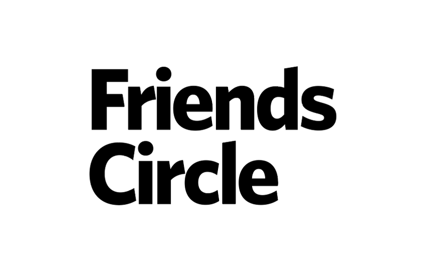
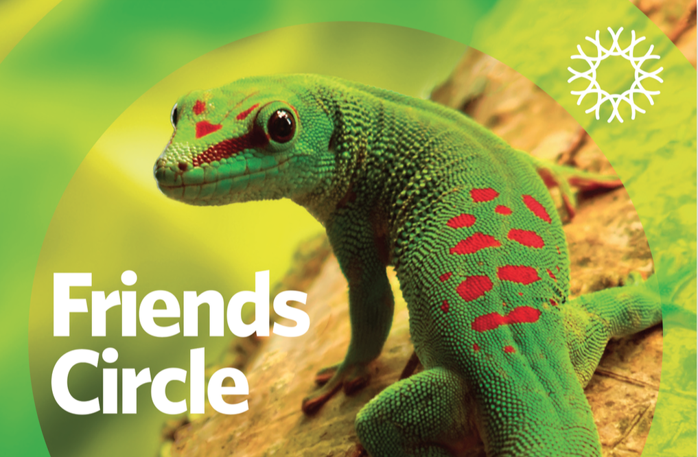
For the most family-oriented donor tier, a chunky wordmark pairs with a thick circle motif and photos of charismatic animals to create a friendly tone. Bright green, a primary brand color for the museum, is dominant in these communications for the museum’s largest donor group.
|
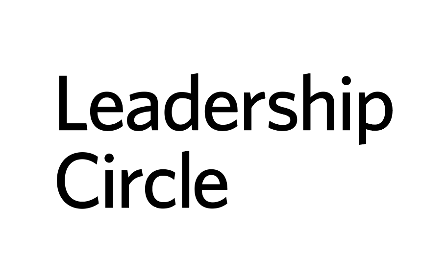
For larger gifts, a thinner type weight and circle motif integrate with photos of plants to present a more sophisticated look. The circle motif is positioned in ways that signal upward momentum and leadership. Oranges and yellows dominate, suggesting optimism and vibrant energy.
|
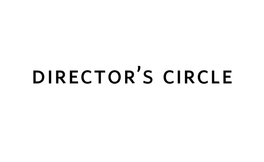
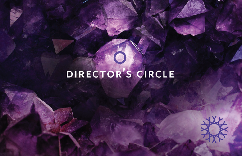
This is the most elevated tier, requiring gifts of $100,000+ to join. The smallness of the circle graphic signals exclusivity and the name in smallcaps suggests elegance. Photos of gems and minerals in rich purples and blues convey a deep and precious connection with nature.
|
For collateral not specific to a tier of giving, I extended the circle concept
with graphic shapes and photos, and applied a more general typography style:
with graphic shapes and photos, and applied a more general typography style:
© 2024 Maya P. Lim


