
Building a Second Brain
Refreshed brand for online school
|
OPPORTUNITY
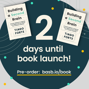
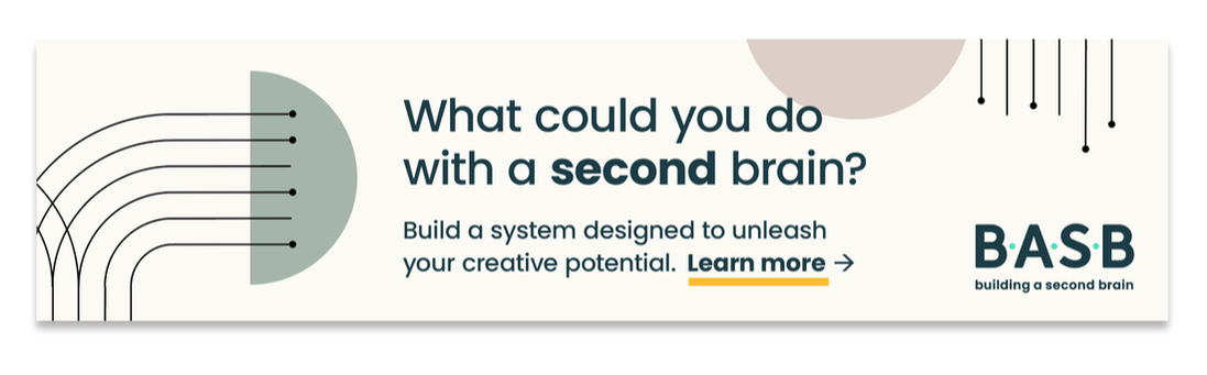
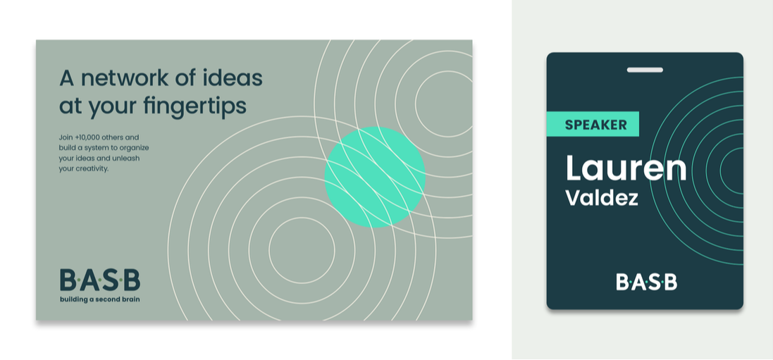
Building a Second Brain (BASB) is a cohort-based course on the leading edge of personal knowledge management, helping thousands of people to manage information overwhelm, find clarity in their work and personal lives, and supercharge their creative output. While its original branding had appealed to hard-core techies, the company needed to evolve its visual identity to match (and attract more of) its rapidly growing mainstream audience. The branding also needed to show that the program had become a sophisticated and premium (yet fun) experience. SOLUTION After conducting audience research (and taking the 5-week program myself), I solo-designed a comprehensive visual identity system that balanced a digital look with a human, friendly feel. Circuitry reflects the company’s technological underpinnings and remixes flexibly to suggest different meanings across digital and print media. A quirky yet highly legible typeface helps copy to take on a more personable voice. A muted color palette with pops of energetic accents provides both sophistication and playful warmth. |
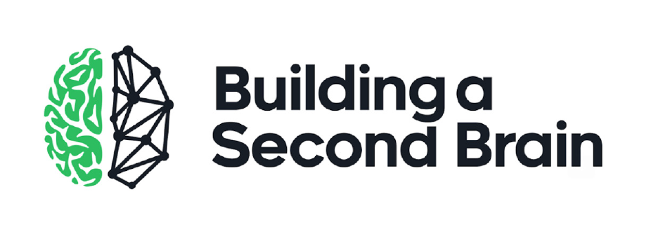
Original logo
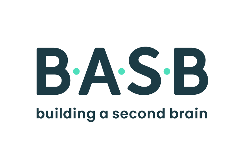
The refreshed logo
|
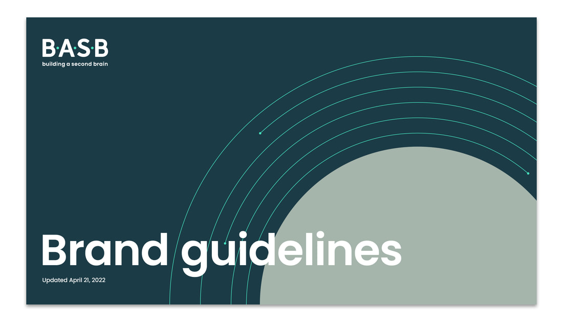
Guidebook
|
I produced a brand guidebook detailing the new visual identity system, articulating the design strategy and writing the copy for all mockups. I also produced a library of circuit graphic elements for easy content creation. The brand media kit is here. Or, click to view only the guidebook.
|
Click to view guidebook
Digital assets
|
|
Applications

|


|
|
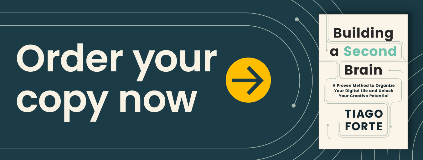
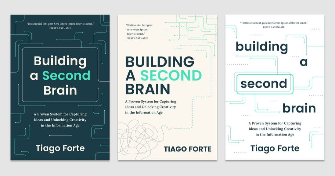
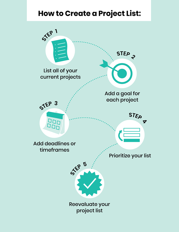
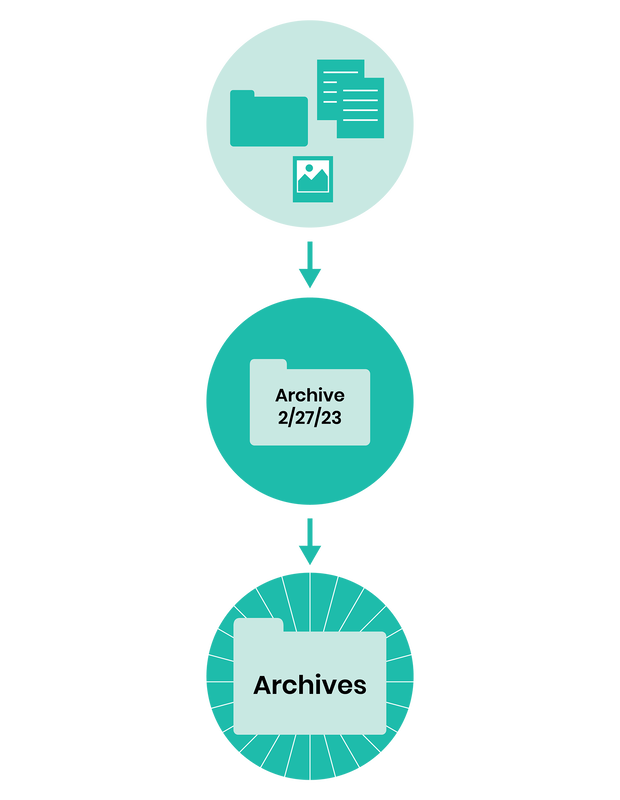
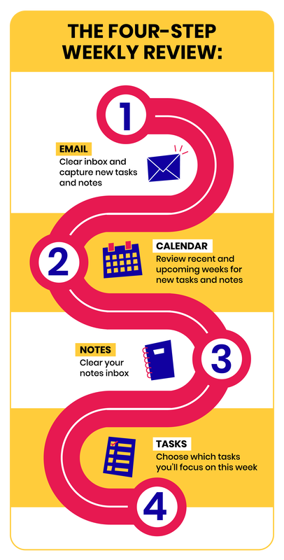
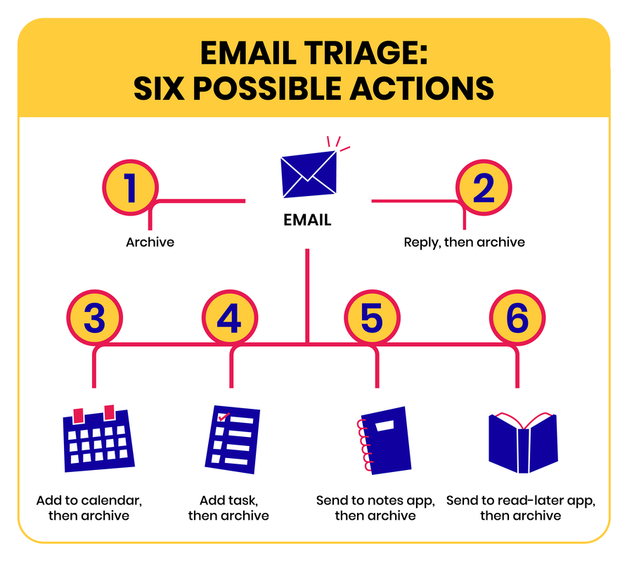
During the rebranding, the founder was writing a book about the course. I produced diagrams and illustrations that are featured in the book and suggested cover designs to integrate with the new branding. The cover that Atria Books produced (view here) shared similarities with my concepts below.
|
Worksheets
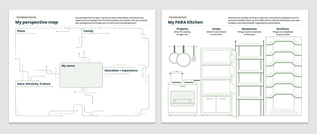
Click to view sample of workbook
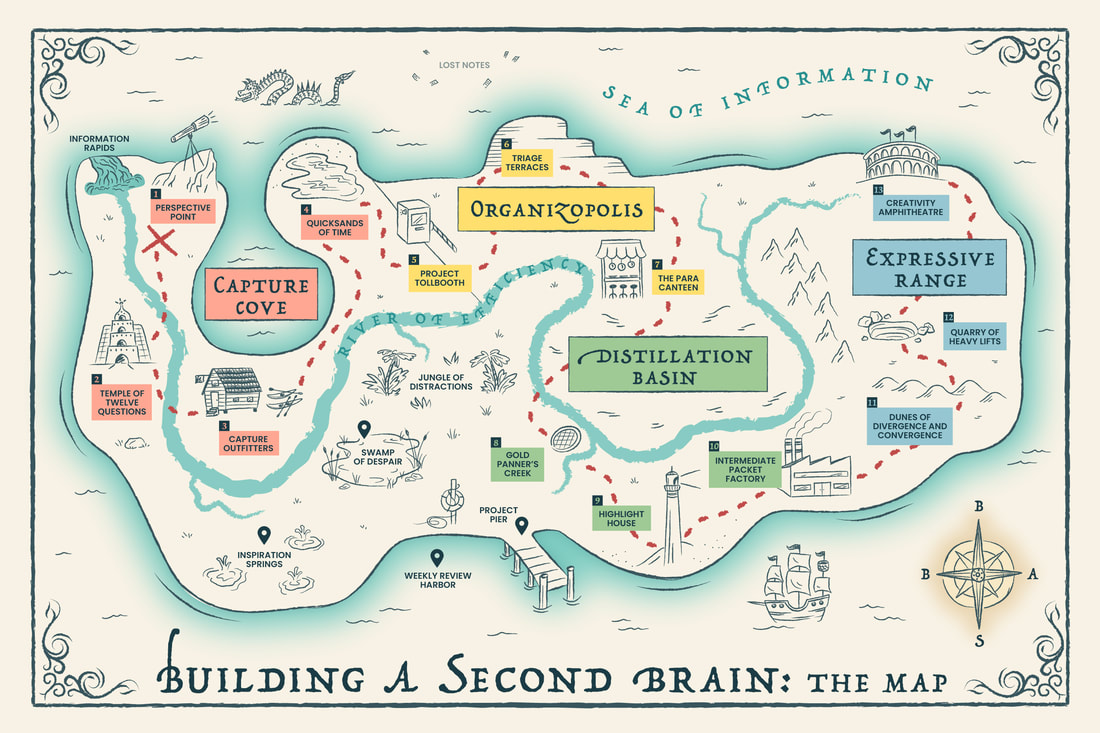
Curriculum map
|
We decided to diverge from the visual identity a bit (okay, a lot) with an old-fashioned treasure map to portray the adventure and fun that is the course experience. I brainstormed the location names with the team and I designed this map to have interactive links transporting the user to each of the lesson modules within the learning portal.
|
Print book (interior design and illustrations)
|
OPPORTUNITY
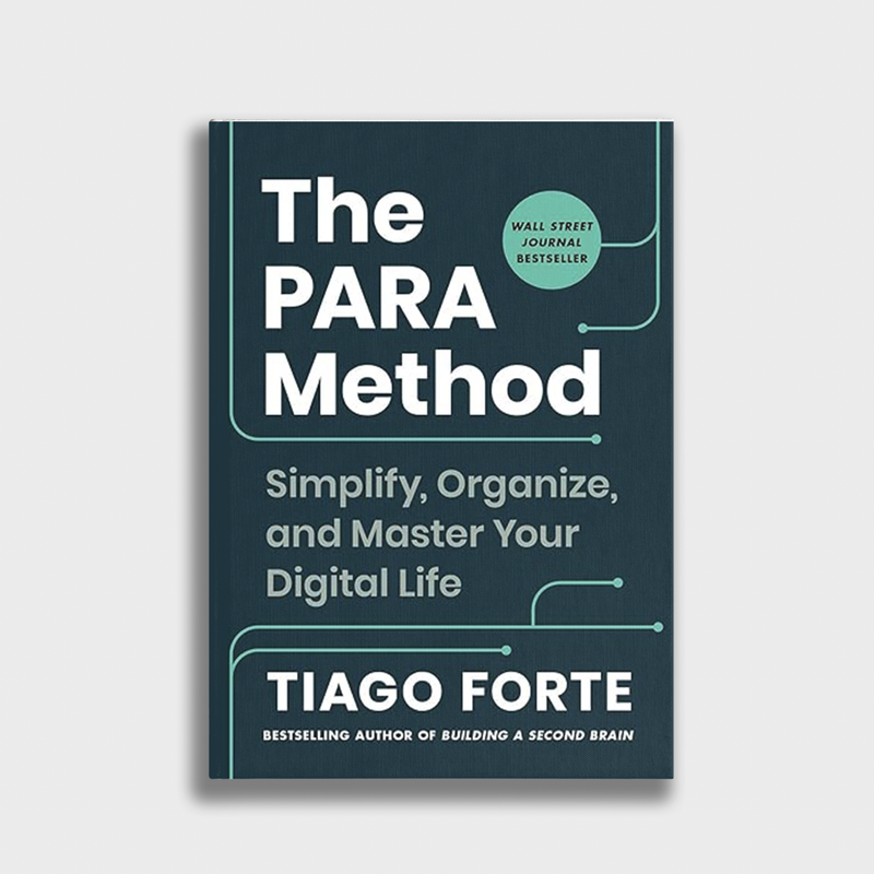
Atria Books, a division of Simon & Schuster, contracted me to design and illustrate Tiago Forte’s much-anticipated second book on productivity (the book became a Wall Street Journal bestseller). The manuscript needed diagrams and illustrations to portray concepts about information organization and creativity. SOLUTION I designed all of the book interiors and created more than 50 spot illustrations, patterns, and diagrams. By request of the publisher, I used only two ink colors throughout the book. |
|
Samples of illustrations for the book. (Examples of book interiors coming soon!)

|

|

|

|

|

|

|
|
|

|

|


Secondary brand design
|
OPPORTUNITY
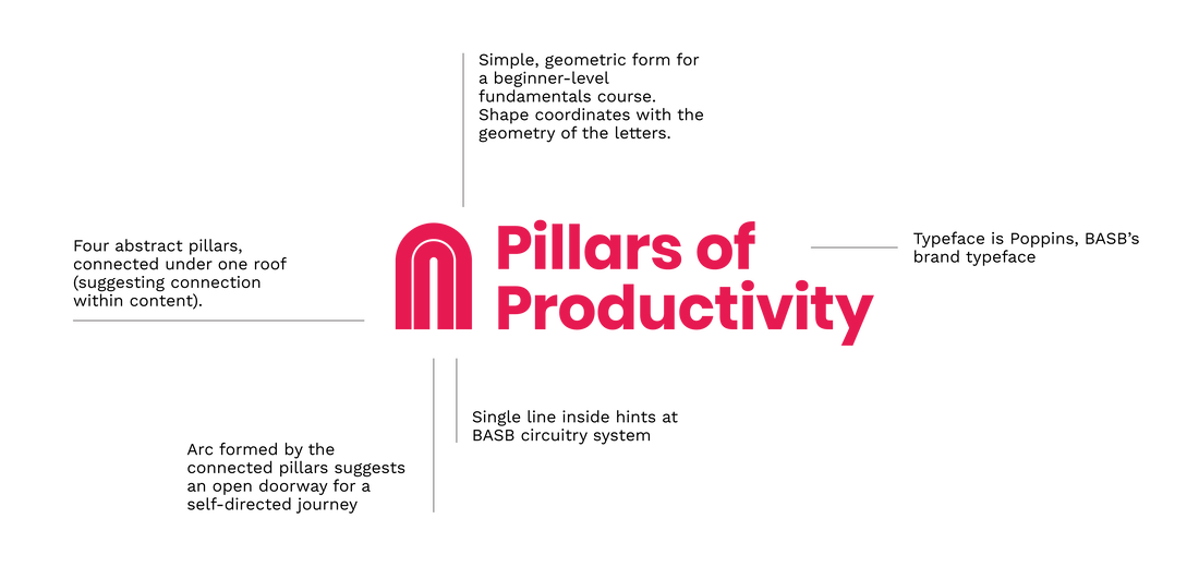
Forte Labs planned to launch a self-directed online course, Pillars of Productivity (POP). They wanted to signal this course would be less about tech tactics than Building a Second Brain and more about fundamentals of productivity…something that could be taken as a precursor to BASB. They were also keen on using colors that pop (to match the acronym name), and veering away from the BASB visual branding to attract a different audience…but they still wanted some cohesion between the two brands. SOLUTION I designed a logo depicting pillars and a doorway, drawing a shape based on the circuitry art of the BASB graphic system. The typeface is the same as in BASB, also helping to relate this brand to the more established brand. Circuitry artwork appears in arcs, subtly mirroring the pillar concept. I used primary colors to suggest the fundamentals approach, but the richness of the hues prevents them from looking juvenile. More than 2250 people signed up for the course within five days of its launch. |
|

Social media header banner

Social media post
|

Video title card
|

|

|

|

|

|
Icons
Workbook diagram
|
Workbook diagram

Conceptual illustration
|